Character · Evidence · States · Text · Colour · Surfaces · Shape & space · Buttons · Symbols · Components · Placement · Motion · Haptics · Words · Accessibility · Building a screen · Conflicts
Design System
The rules every Anchor Alert screen follows. They are read out of the app as it ships, so where the code and this page disagree, the code is what skippers see and this page is the intent.
The rules that already have a home win over this page: the palette and the invariant in
AGENTS.md, the words in Docs/copy.md. Tokens live in AnchorAlert/Helpers/:
MagicValue.swift for sizes, AppButtonStyles.swift for buttons, BrandChrome.swift
for the bar; colour is AnchorAlertWidgets/BrandPalette.swift, drawn on the Palette
page. Where the app is inconsistent, the rule here is the choice to build to. Amber boxes mark the conflicts in place, and
they are all together at the bottom.
Character
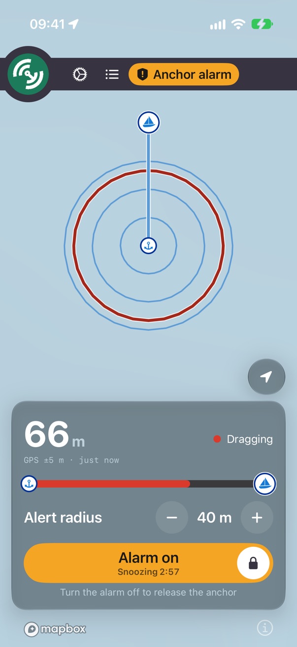
An anchor alarm for a phone below deck at 03:00. One screen: a map with the anchor, the circle and the boat, a bar
across the top, and a glass panel at the bottom that answers "are we dragging?" without a tap. Everything else is a sheet
over it. The app is locked dark (AppMain.swift, #207): the bar, the menu circle and the banner are
MarNav's chrome grey, and a light page under them read as two apps stitched together. The chart under it keeps its own
style (onDay, onNight or onCHART).
Glanceable at 3 a.m.
The distance is the biggest thing on the screen, and the word beside it says what it means: Holding, Checking, Dragging, Can't judge.
Calm until it isn't
Green all night, amber when something is worth a look, red only for the two minutes you are not asleep. Red is never decoration.
Rings by itself
Nothing on the screen waits on a network, an account or a reply. The paywall gates starting a watch and never touches a running one.
An alarm needs evidence
The rule that shapes the most screens (AGENTS.md). Silence is not evidence: when an observation has an
innocent cause and a fatal one, the app reports it and says what it doesn't know, rather than acting on a guess.
.unknown is first-class in SystemsCheckStatus, not a synonym for failing.The watch's states
AnchorWatchStatus names them, in AnchorAlertWidgets/ so the Live Activity draws the same set.
Each has a title, a glyph, an ink and a Live Activity swatch.
| State | Colour | Glyph | Panel | Haptic |
|---|---|---|---|---|
| No anchor | grey | mappin.slash | "Mark anchor" in green, or amber when a tap will explain rather than act (no fix yet, no subscription) | success on mark |
| Holding | holding | checkmark.circle.fill | Green dot "Holding"; the slide arms the alarm | medium on arm |
| Checking | attention | ring + exclamationmark | An amber ring filling toward the siren | medium |
| Can't judge | grey | location.slash.fill | No usable fix: never Holding | medium |
| Dragging | danger | exclamationmark.triangle.fill | Red "Dragging" | warning |
| Alarm | danger fill | bell.and.waves.left.and.right.fill | Bar goes red and throbs "Alarm"; Snooze appears; the slide goes red, "Slide to turn alarm off" | the siren's buzz, every 0.2 s |
| Snoozed | attention | — | Amber slide, "Snoozing m:ss"; no case of its own | none |
| Alarm off | attention ink | bell.slash.fill | Anchored, not armed: the green slide says "Slide to turn alarm on" | warning on disarm |
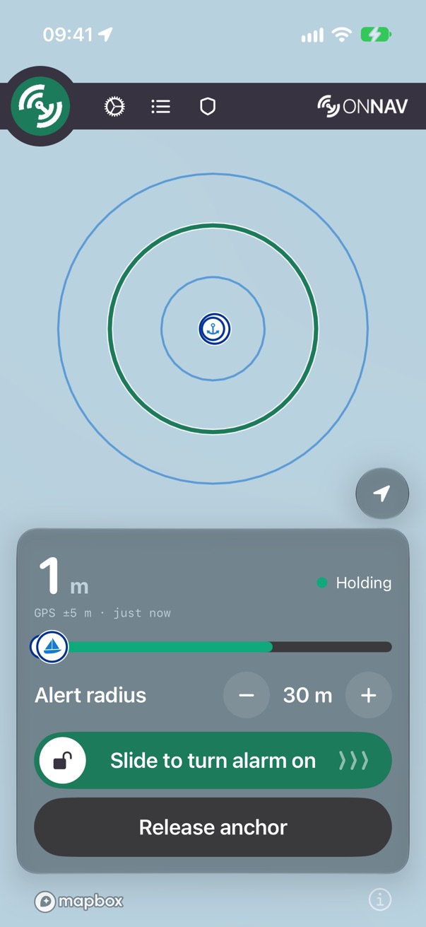
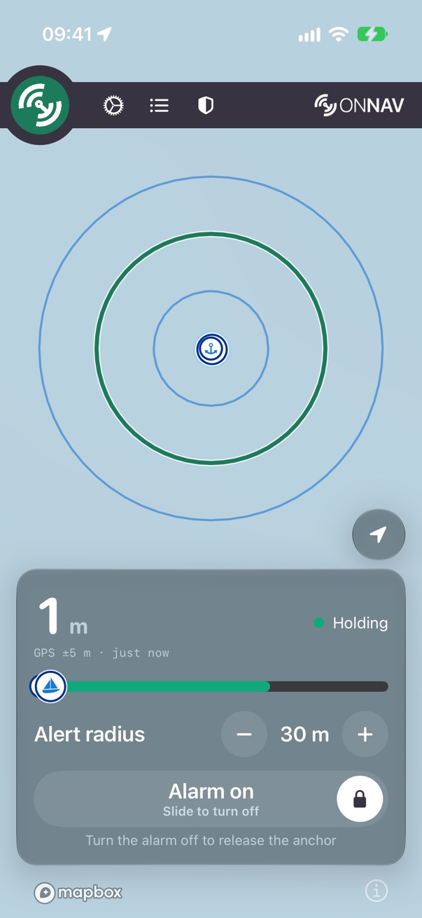
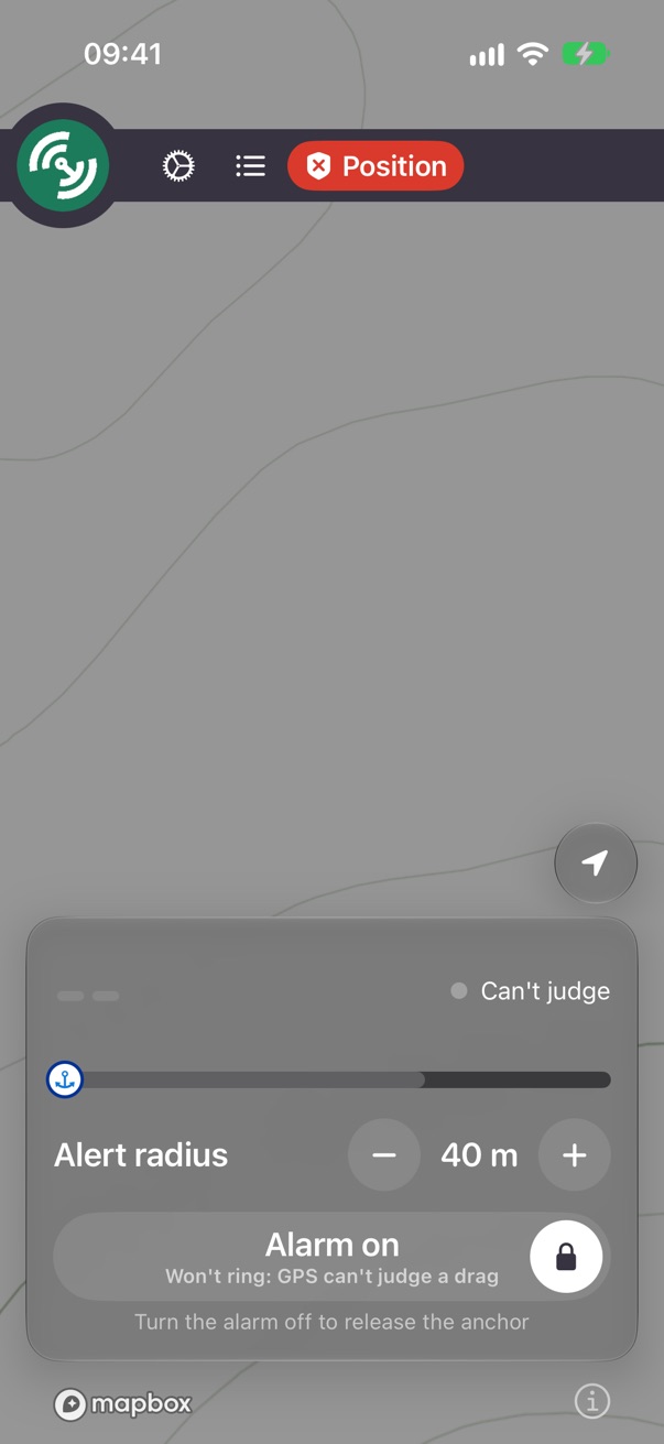
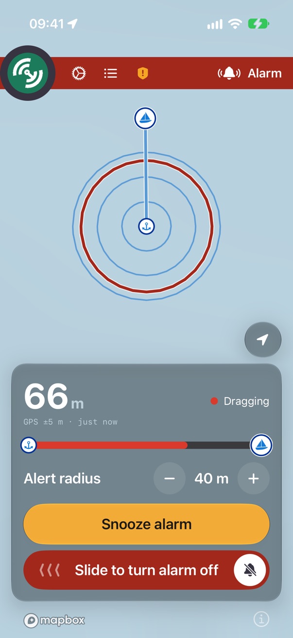
determinePosition (the alarm left out); the map ring, the haptic and the Live Activity read
determine (the alarm folded in). With the alarm off and the boat outside the circle, the badge says amber
"Checking" while the ring stays green, and the status haptic never fires while disarmed, which
DetermineStatusHaptic's own doc says it should. Build to: position for the badge, bar, ring and
haptic; the alarm only on the surfaces that are about the alarm (the bar, the slide).AnchorWatchStatus case. While the panel shows amber
"Snoozing", the Lock Screen and Dynamic Island show red "Dragging" with the red wash. Build to: a
.snoozed case, attention, zzz (Always on's symbol for snooze already).Text
System text styles, so text follows Dynamic Type. The distance readout is the one fixed size, because a number that shrinks at night is a number you can't read across the cabin. Samples are at the default text size.
| Role | Sample | Style | For |
|---|---|---|---|
| Distance | 23 m | 48 pt SF Rounded bold, mono digits (36 when space is short); unit Title 3 bold, secondary | The panel's readout |
| Radius | 30 m | Title 3 semibold, rounded, mono digits | The alert radius between − and + |
| Control title | Alert radius | Title 3 semibold | Radius label, the slide's title |
| Verdict | Holding | Subheadline, primary, one line | The badge beside the distance |
| Reading | GPS ±5 m · just now | Caption 2, monospaced, secondary | The instrument line under the distance |
| Sheet hero | Release the anchor? | Title, semibold | The question a decision sheet asks |
| Onboarding title | Allow location | Large Title, bold | Full-screen onboarding pages only |
| Row title | Position | Headline | Systems Check domains, log rows, menu rows |
| Card header | If the alarm fires | Subheadline semibold, secondary | .sheetCardHeader() |
| Detail | Fixes every second, ±5 m | Subheadline, secondary | Second lines |
| Note | Turn the alarm off to release the anchor | Footnote, secondary, centred | The line under a button |
| Caption | Today, 21:40 | Caption, secondary | Timestamps, sub-checks |
.monospacedDigit() so they don't jitter as they tick.isAccessibilitySize, rather than truncating.textCase, and headers are sentence case. The log's "ALARM" is the one deliberate shout.TimelineView without mono digits. Build to: rounded for the distance
wherever it is drawn; mono digits on every time that ticks.Colour
Every colour is a role, and every role is on the Palette page with its contrast. The three rules
from AGENTS.md:
BrandSwatch). Nothing outside the palette hands a view a Color.BrandInk. A glyph, dot or line has no background of its own, so it is
the one part of the palette that flips with the appearance (only the dark side ships). A fill used as ink is the #30 bug.AppButtonTone, PanelCapsuleTint,
BrandChrome, AnchorWatchStatus.color, SystemsSummary.tint.neutral is Continue, Test alarm, Done and the map's
scale rings. Green starts a watch; red ends one or throws work away.BrandInk flips per appearance, BrandPaletteTests measures both, and AGENTS.md
asks for every pair to be legible "in both appearances", but since #207 the app is locked dark, so the light side is drawn
only on canvases. Build to: say so in AGENTS.md and in BrandInk's doc (dark is what
ships; light is kept for previews), or retire the light half.ButtonRow's destructive glyph is danger.fill (red4) on a dark list cell: 1.9:1, the #30 failure
again, under a comment arguing the bare colour is allowed. A Remote contact's warning line, the paywall's checkmarks and
onboarding's icons use fills too; they pass on dark today only because the app is locked dark. Build to:
BrandInk for every one.AnchorWatchStatus): the brand steps sink on black. But white reads at 2.0 to 2.2:1 on that
green and orange, and nothing measures it. Its stale pill is a raw Color.orange, and its radius bar stays
green under red "Dragging", the mistake the in-app bar's doc says it fixed. Build to: keep the system hues, give
green and orange a dark label, measure the swatch in the tests, and colour the bar by status.danger red on the
live map and in the replay, with no drag behind it. The replay draws the alert ring in scale-ring blue at 3 pt where the
live map uses the verdict colour at 6 pt. "Can't judge" is three greys (.systemGray, .secondary,
.gray). Build to: a quiet track colour, the live ring's style in the replay, one grey token.BrandRamp.red5 says
it is "the one that ships"; danger is red4, and the Palette page shows red5 unused.
BrandChrome and PanelCapsuleTint call red4 "Alarm Red", the sheet's name for red3.
Color+App describes scaleRing as the anchor's travel line; it draws the anchor-to-boat line.
Build to: fix the comments; red4 is what ships.Surfaces
Map
Mapbox, full bleed, the anchor, the circle and the boat. Everything else floats over it or slides up over it.
Bar · BrandBar
Opaque chrome grey across the top, MarNav's 76 pt circle menu button hanging off its leading edge, shortcuts, the wordmark trailing. Always dark; red and throbbing while the alarm rings.
Panel · MainPanel
Regular .glassEffect, continuous radius 20, inside a
GlassEffectContainer. Bottom of the screen in portrait, a 360 pt side column when wide.
Sheets
On systemGroupedBackground. Card pages use SheetCard
(radius 18, the same as an inset-grouped list); settings-like pages are a Form or List.
brandProminent exists).glassEffect adds none: a glass button without
.contentShape is tappable only on its letters. That cost a tester his anchor release.SheetCard pages (Systems, Always on,
Release), system Form/List (Settings, Log, Remote), and menu-row cards at radius 8 (Menu, About).
They have different headers, separators and corners, and MagicValue.cellCornerRadius exists only to make 18
match a list. Build to: inset-grouped lists for settings-like and log content; SheetCard only where rows
need custom disclosure, with one header style..onboarding on Mark,
Release and Subscription) although brandProminent's doc says a sheet is a flat page and should be solid.
Tinted glass shifts the fill, so the contrast measured on the palette doesn't hold. Build to: solid on every sheet;
glass only over the map.largishPadAmount, a padding token. Build to: one icon shape
and size token; a named panelCornerRadius.Shape & space
Spacing
MagicValue's scale. Plain .padding() (16) stays plain.
Sizes
| Token | Points | For |
|---|---|---|
minimumTapTargetSize | 44 | Nothing tappable is smaller (but see the conflict) |
mainMenuButtonSize · brandBarMinHeight | 76 · 40 | The circle menu button over the bar |
panelCapsuleMinHeight | 54 | The alarm slide's track |
sidePanelWidth | 360 | The panel as a column, landscape or iPad |
distanceReadoutFontSize | 48 · 36 | The distance, and when space is short |
pressedOpacity · dimOpacity | 75% · 25% | A pressed button; no reading yet |
pressedOpacity everywhere.contentShape.Buttons
AppButtonStyles.swift. A style is a shape and a size; an AppButtonTone (.primary,
.start, .attention, .danger, .inactive) picks the pair.
| Style | Looks | For |
|---|---|---|
.onboarding(tone) | Title 3 semibold, full-width tinted glass capsule | The thumb decision: Mark anchor, Release anchor, Get started |
.onboardingSecondary | The same, solid systemGray4 | The other answer: Not now, Keep anchor, Release anchor on the panel |
.brandProminent(tone) | Headline, solid capsule | A call to action inside a sheet: Test the alarm |
.circular | 44 pt disc on the panel wash | − and + on the radius |
.sheetConfirm | 34 pt neutral disc, black checkmark | Done, on every sheet |
.menuRow | Headline in the accent on an 8 pt card | Main menu and About rows |
.mediumPrimary, .smallPrimary,
.onboardingStart, four fonts in View.swift, BrandChrome.secondaryLabelColor,
PerformAlertAction.showConfirmation. The preview matrix shows styles that ship nowhere. Build to:
delete them, or mark them reserved.Symbols
SF Symbols only. One symbol per idea:
| Idea | SF Symbol | Idea | SF Symbol |
|---|---|---|---|
| Holding · check passing | checkmark.circle.fill | Systems Check (bar) | checkmark.shield.fill · exclamationmark.shield.fill · xmark.shield.fill |
| Check failing | xmark.octagon.fill | Unknown | questionmark.circle |
| Alarm ringing | bell.and.waves.left.and.right.fill | Can't judge | location.slash.fill |
| Alarm on · off (slide knob) | lock.fill · lock.open.fill | No anchor | mappin.slash |
| Log | list.bullet | Settings | gear |
| Recenter (following · not) | location.fill · location | Share, export | square.and.arrow.up |
| Remote | antenna.radiowaves.left.and.right | Stale | clock.badge.exclamationmark |
| Done | checkmark | Delete · recover | trash · arrow.uturn.backward |
exclamationmark.triangle.fill means six things: Dragging, a check needing
attention, a failing summary, blockers, onboarding's caution, and the palette preview. The Systems Check is
checklist in the menu and a shield on the bar. A failing summary is a triangle over a failing row's octagon;
unknown is filled at the top and outlined below. bell.slash.fill is both "alarm off" and "silence it".
Build to: the triangle for attention only; a failing summary takes the octagon; the shield wherever the Systems
Check is a door; a summary wears its worst row's glyph.Components
Build screens from these. A new one gets a row here before it is used twice.
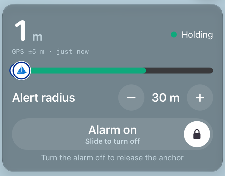
MainPanel
The glass panel: DistanceToAnchorView (the readout, the reading line,
AnchorWatchBadge and DragConfirmationRing), DistanceProgressView,
AlertRadiusControl, AlarmSlideControl and AnchorButton. At accessibility sizes it
scrolls rather than clips.

AlarmSlideControl
Arming and disarming is a slide, never a tap, so a pocket can't do it. The
track is a PanelCapsuleTint: green to arm, the panel wash while armed, red while ringing, amber while
snoozed. VoiceOver adjusts it, and focus jumps to it when the alarm rings.

BrandBar · BrandBarShortcuts
Menu circle, Settings, Log, the Systems Check shield, the onNAV wordmark (About). The shield is the Systems summary at a glance; it drops its word at accessibility sizes.
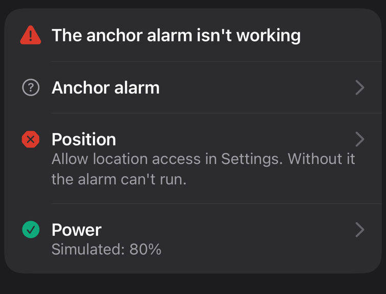
SheetCard · SheetTitleRow · SystemsStatusIcon
Card pages: a
grouped card, a header, rows with a status icon column, a title and a secondary detail, collapsible with
CollapsibleContent. SystemsStatusIcon can only be built from a named status.
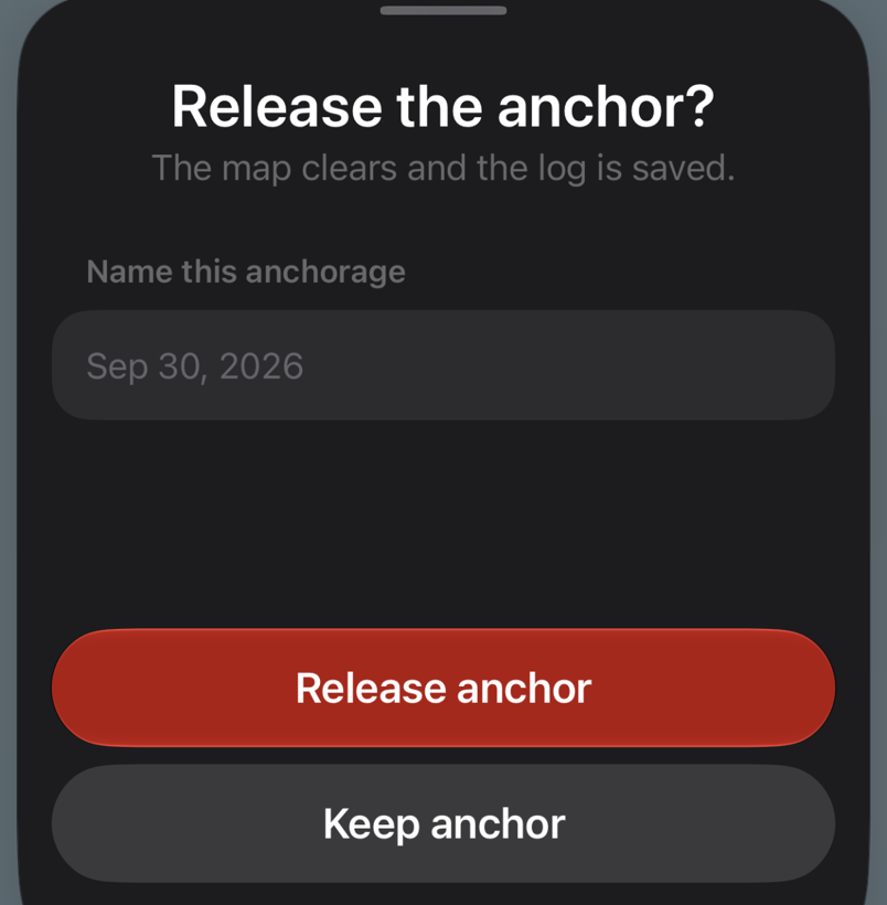
Decision sheet
A question as the hero, a line of consequence, and two full-width thumb buttons pinned at the bottom: the act in its tone, the way out in grey. Mark anchor and Release anchor.
SheetTitleRow with a
fixed icon column, so it drifts from the Systems Check at large sizes. The Live Activity copies the drag ring and the
progress bar with literals and has drifted. Status pills are drawn four ways, status dots two, the centred icon-and-title
hero eight, the thumb-button bar twice, empty states four. Build to: move the ring, bar and a StatusPill
into AnchorAlertWidgets/ where both targets see them; a SheetHero and a
SheetActionBar.Placement & navigation
One screen
The map is the root. Onboarding replaces it until done; everything else is a sheet over it. No tabs, no covers, no popovers.
One sheet at a time
Every sheet is a ModalSheetKind opened through
PerformModalAction, which closes the current one first.
Done is a checkmark
A neutral disc, trailing, labelled "Done". Swiping down does the same. There is no ✕ anywhere.
Decisions get a sheet
Marking when the GPS isn't ready and releasing a watch open a sheet that asks; a tap never ends a watch by itself.
Inline titles
Every navigation title is inline; no large titles.
Thumb at the bottom
The panel and the decision buttons sit where a thumb reaches in a bunk.
.sheetDoneButton's own doc says pushed views need Done, and the Log adds it to its pushed session. Opening
Settings at Remote lands one push deep with no Done. The contact editor uses Cancel and Add text buttons. The menu shows a
grabber, About at the same detent doesn't. Build to: Done on every page of a sheet; Cancel and a verb only for a form
that can be abandoned; a grabber on every sheet with two detents.BrandBar say Log, Settings, Systems; the menu says Log, Systems Check, Settings. Build to: a
title is its door's label; one order.Motion
State changes ease
A tint, a word or a bar moving to a new state eases in and out. Disclosure
is 0.25 s (MagicValue.disclosureDurationInSeconds); the map style is
AppAnimations.changeMap. Numbers roll with .numericText, glyphs swap with
.replace.
Only the alarm calls attention to itself
The bar throbs while ringing
(AlarmPillAnimation); the menu button wiggles to be found. Both stop under Reduce Motion.
.easeInOuts in views and nine bare
withAnimation {} springs in Operations, so one tint change springs when an Operation drives it and eases when a
view does. Reduce Motion isn't checked for the map's one-second pan on every fix, the springs in Operations, or the slide
settle, which falls back to an ease rather than nothing. Build to: named curves in AppAnimations and one
helper that returns none under Reduce Motion.Haptics & sound
Two families that must not be confused (AGENTS.md). The alarm buzz is the whole-phone motor, every
0.2 s while the siren loops, off when the skipper turns Vibrate off. The interface taps are
UIFeedbackGenerator, fired from Operations, never gated on Vibrate, and never the only carrier of anything.
| Moment | Tap | Moment | Tap |
|---|---|---|---|
| Radius step | selection | Arm · disarm | medium · warning |
| Touch the anchor mark | light | Drag past the move threshold | medium |
| Mark · release | success · success | Checking · Dragging | medium · warning |
Words
The rules are Docs/copy.md; this is the short form, and what the app does against it. Every sentence a
skipper reads is in a Copy/ module with a preview that draws all of it, decided beside the surface that
shows it.
One word per thing
alert radius, GPS reading, notification, log, anchorage, on and off, device, Systems Check, subscription. "Fix" is the verb for a remedy, never a GPS reading; "alert" is the app's name and the radius, never a notification.
Sentence case
In the app's voice, always. Title Case only for an iOS control the skipper will go looking for (Low Power Mode, Precise Location) and screen names (Systems Check, Recently Deleted).
Label, colon, consequence
"Low Power Mode: …". No em dashes in a string a skipper reads. Fragments only where the container clips: a badge, a button, a row title, the Live Activity.
Remedy first
In the imperative, and only where the skipper can apply it. A Systems Check row is a question; the line under it answers Yes or No, and Yes is always the good answer.
Anchor Alert, two words
® on the first or most prominent use only: onboarding's welcome, About,
Remote's headline, the exported log. AnchorAlert is the bundle and the code.
meters
American spelling, to match the Distance setting. The rule is consistency, not dialect.
copy.md.AGENTS.md says Remote alerts after 20 minutes of silence; the code and its docs say 30.
copy.md quotes examples the app no longer says. data-flow.md names views that don't exist
(summary bar, dashboard, alarm overlay). PLAN.md is wholly historical, down to the bundle id. Build
to: fix the listing's volume claim before review; 30 minutes in AGENTS.md; archive PLAN.md.Accessibility
- Glyph-only controls get a verb: "Widen alert radius", "Recenter map", "Done", "Menu".
- Readouts are one element with a label and a value, read in units: "Distance to anchor", "GPS accuracy", "Alert radius" (adjustable).
- The alarm slide is adjustable, and focus moves to it when the alarm rings.
- At accessibility sizes titles wrap to two lines, the bar drops its words, and the panel scrolls rather than clips.
Building a screen
For agents. Before writing a view:
- Decide what it says when it doesn't know. Every state with no evidence looks like one; see An alarm needs evidence. Nothing in it may wait on a network to ring.
- Over the map, glass; in a sheet, a solid page. A new sheet is a
ModalSheetKind, opened throughPerformModalAction, with.sheetDoneButtonon every page. - Colour comes from a role: a tone, a swatch, or
BrandInkfor anything on the page. No hex, no.red, no fill as text. - Sizes come from
MagicValue; strings from aCopy/module with a preview; values throughFormat. - Side effects and haptics go in an Operation; the view only fires it.
- Every glass button ends in
.contentShape; every target is 44 pt. - Add a scenario to
Design/screens.ymland the screen to Screens.
Text(warning)
  .font(.footnote)
  .foregroundStyle(
BrandPalette.attention.fill)Text(warning)
.font(.footnote)
.foregroundStyle(
BrandInk.attention)Conflicts, all together
Where the app disagrees with itself today, each marked in place above with the choice to build to. None is fixed yet; a PR that fixes one takes it off this list.
- Two classifiers: the badge and the ring disagree with the alarm off; the haptic is silent while disarmed.
- No snoozed state: the Lock Screen says red Dragging while the panel says Snoozing.
- Alarm off green, amber and orange.
- Sheet hero titles four ways; the distance in two designs.
- Locked dark, while the ink and its tests serve both appearances; fills drawn as ink, one at 1.9:1.
- The Live Activity's swatch unmeasured and under 3:1; its bar green under Dragging.
- Red for the track, three greys for Can't judge, two ring styles.
- Palette comments that name the wrong red.
- Three sheet models; glass buttons on flat sheets; two icon shapes.
- Two spacing grids; targets under 44 pt.
- Unused styles and tokens.
- The triangle for six ideas; two doors for the Systems Check.
- Hand-rolled copies, and the Live Activity's drifted ring and bar.
- Done missing on pushed pages; doors and titles that disagree.
- Unnamed animations; Reduce Motion half-checked.
- Mark and release feel the same; Snooze is silent.
- Case slips on onboarding's buttons and the coordinate formats.
- Glossary gaps: alert, siren, the Lock Screen card, Remote, Silent Mode.
- One state, several wordings: the Systems headline, an old GPS reading, a drag with no siren, the Notification toggle.
- Docs behind the app: the store listing's "full volume", Remote's 20 minutes,
copy.md's examples,PLAN.md. - Two "Anchor alarm"s; unlabelled status icons; no headers.
Anchor Alert • Send feedback • © 2026 onNAV LLC